


HAILO
Improve Passenger Allocation Experience to Reduce Cancellations
Hailo tracked a high number of passenger cancellations during the time we tried to allocate them a driver. The goal for this project was to understand the reasons behind the cancellations and improve our passenger experience by managing their expectations and reassure them that we'd always get them a taxi.
Here's a peek at the before and after Passenger Allocation screen:
CASE STUDY#1
Lead Designer - ios & Android
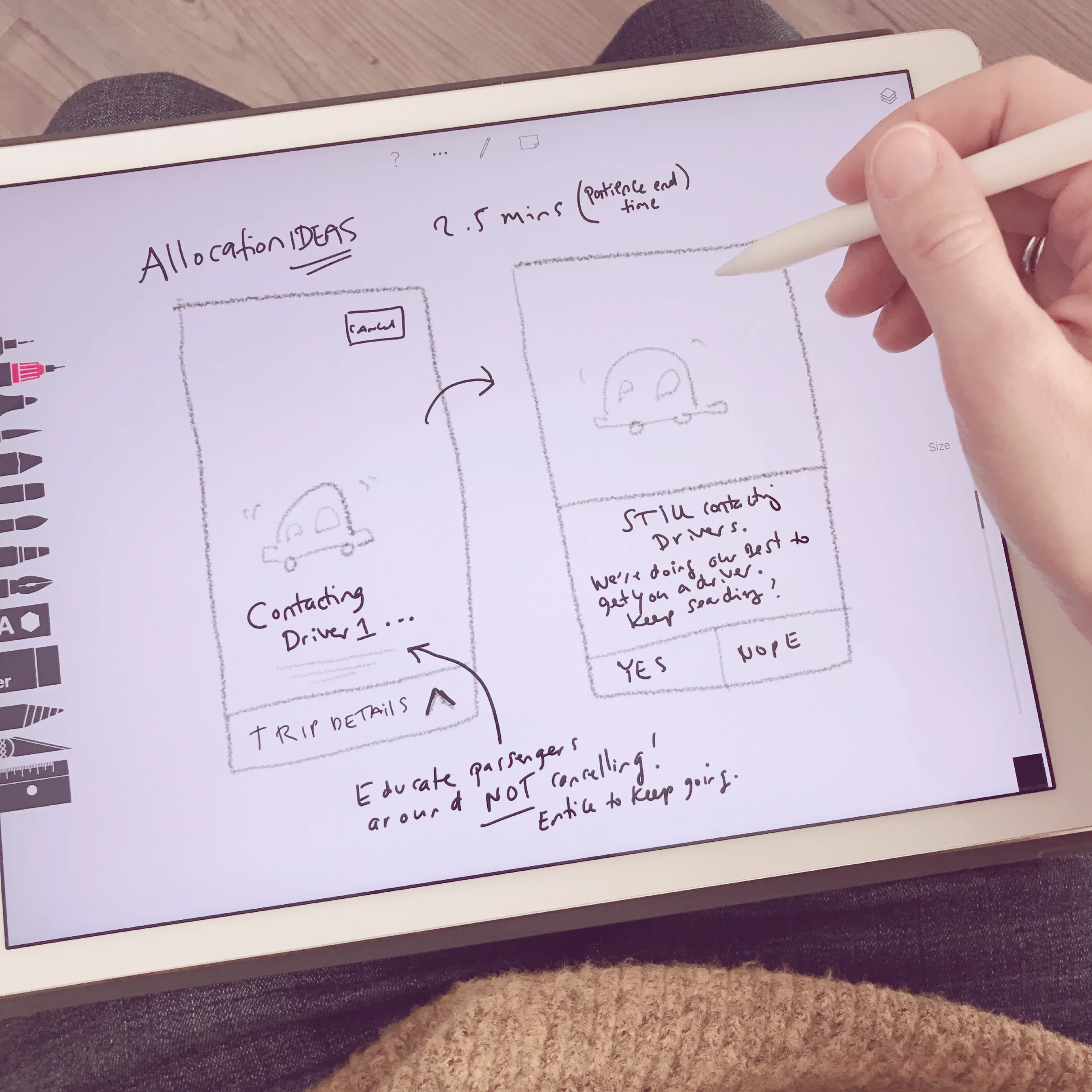
Left: Previous Allocation experience - lacking important trip details and appearing broken after a few seconds, with a very enticing cancel button. Right: New Allocation experience that's personable, dynamic and interactive. Passengers are kept informed about their order and can tap the 'Requesting' modal to reveal their trip details.
DISCOVERY
I wanted to start by understanding why passengers were cancelling their taxi requests when waiting for Hailo to allocate them a driver. I wanted to find out what changes could be made to the overall waiting experience and UI, to encourage passengers to wait longer and trust that Hailo would always get them a taxi.
I set out on the following:
- Worked with the data team to identify how many passengers cancelled jobs during allocation
- Worked with research to send a survey to passengers who cancelled more than once during allocation to analyse their needs and sketch out use cases
- Started thinking of 'what if' scenarios for a better taxi allocation experience
- Brainstormed work flows alongside the product manager and engineer lead
RESEARCH
After exploring data and analysing the survey results I concluded the following research for my design thinking and validation:
- Finding ways to keep passengers waiting for longer during allocation - my hypothesis was that if we communicated to passengers what was happening in the background while they were waiting, they would be more likely to wait until a driver accepted the job.
- Creating an experience where passengers feel reassured - if, for example, we invested in conversational design where we explained that we were looking for the most suitable driver, the passenger would trust that we were doing our best.
- Reviewing allocation screens on competitor products.

SOLUTION
Over the discovery and research period I explored several ideas, doing lots of quick sketching and turned the best concepts into a series of prototypes. I then tested the prototypes internally across the business as Hailoers could give valuable insights. After some iteration and tweaking based on their feedback I created a final prototype which I tested on Hailo passengers.
Here is what I concluded for the final design solution:
- Passengers thought the previous allocation screen seemed broken because nothing changed after a few seconds, which resulted in high number of cancellations. By adding dynamic conversational messaging that was personable and informative, passengers saw a continuous change on screen and were confident to wait longer because they felt reassured throughout their wait.
- Revised all pop-up messaging that appeared when passengers tried to cancel, making sure they were encouraging and helpful and managed their expectations.
- Made important UI improvements that further assured passengers not to cancel, for example; included an interactive modal that passengers could swipe through to see their trip details, like their pickup/dropoff location, their payment method and number of seats they requested.
Here's the final flow:


Flinto prototype of the new Allocation screen that I tested internally with Hailoers and exteranlly with Hailo passengers.
IMPACT
I worked for 3 weeks on this project and had an immense sense of joy seeing my ideas come to life a few weeks later, when engineers shipped the new allocation experience to our passengers. The data immediately began to show I had solved a variety of problems and together with the team working on this, we achieved our goal of decreasing the number cancellations. 🎉
